
Breaking from Beige: Using Color to Show Our True Selves in Miami Interior Design
- Dec 12, 2025
- 3 min read
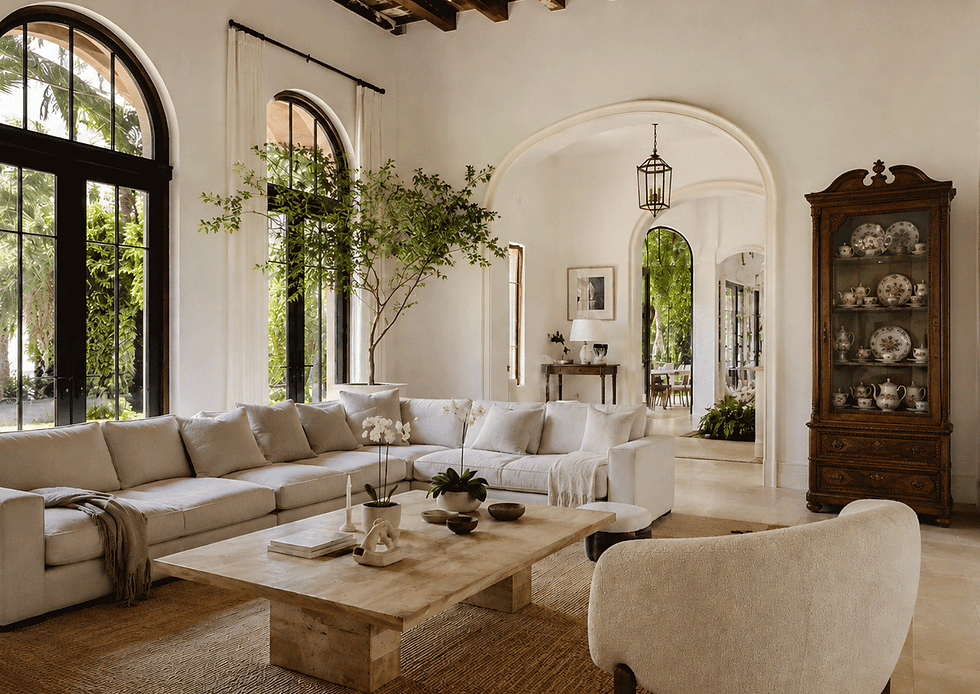
In an earlier post I was vocal about how (and why I believe) it seems we cannot let go of beige in Miami Interior Design. So, in this post, I will share some tips on how to incorporate color into your spaces to make them welcoming, comfortable, and reflective of your personal style (and free yourself from cookie cutter beige!).

Colors don’t just serve an aesthetic function; they have psychological impacts that can shape how we feel, behave, and experience a space. This is the essence of color theory —the study of how colors work together and influence our emotions and decisions. By understanding the psychological effects of color, we can craft spaces that do more than look good—they can evoke specific moods, create balance, and even affect productivity or relaxation.
You don’t need to rely solely on paint color to introduce color theory. Textiles, furniture, and artwork bring in color. A neutral room can come to life with accent pillows in calming blues, a rug with energetic oranges, or art with deep purples.

Colors have different meanings and emotional effects across cultures, but there are some generally accepted associations in Western color psychology:
Red: Passion, energy, and excitement. It stimulates emotions and can raise energy levels, making red a good choice for active spaces like kitchens or gyms. But beware, too much can overwhelm, so use red sparingly.
Blue: Calm, peace, and serenity. Blue tones are great for spaces meant for relaxation, so it’s a fave for bedrooms. Lighter blues can make spaces feel airy; darker blues add sophistication.
Yellow: Happiness, warmth, and creativity. It’s cheerful and sunny vibe makes it ideal for kitchens or living spaces. Very bright yellows can sometimes feel agitating, so softer shades are better in large doses. However, it is not recommended for your baby’s nursery. Studies show that prolonged exposure to yellow agitates babies, making them cry more frequently.
Green: Balance, harmony, and rejuvenation. Associated with nature and often seen as the most restful color for the eye, green works well in almost any room, promoting a sense of calm and freshness.
Purple: Luxury, creativity, and mystery. Traditionally associated with royalty, deeper purples work well for adding richness to a room, while lighter lavenders can be calming, making them a good choice for bedrooms or meditation spaces.
Orange: Energy, enthusiasm, and warmth. Like red, orange is a high-energy color. It’s excellent for social spaces like living rooms or dining areas, but can be overstimulating for bedrooms or offices.
Neutrals: Simplicity, elegance, and balance. Neutral colors like white, gray and beige are versatile and create a clean, sophisticated backdrop. While some neutrals like white or gray can feel cool, combining them with warm accents helps create a cozy environment.
Selecting the right colors for your spaces
You should strive to find a common thread to create cohesiveness across all the spaces in your home. This can be achieved via color, but also lighting, textures and finishes can create consistency.
Once you have your base palette, get creative with the color in specific areas of your home.
The function of the room should guide your color choices. Here are some ways to introduce color based on the use of each space:
Bedrooms are for relaxation. Soothing tones like blues, greens, or soft purples are ideal.
Living rooms are for socializing. Warmer tones like beige, soft yellows, or muted reds can create a welcoming atmosphere.
Home offices should promote focus and productivity. Muted shades of green or blue often work well. Bright accents can add bursts of creativity.
Remember that lighting significantly alters our perception of color, so always test paint samples under the lighting conditions of the room to get a sense of how a color will look throughout the day. A vibrant yellow that looks sunny and happy in natural light may appear dull under certain types of artificial lighting.
If you're drawn to a bold color like deep red or electric blue but don’t want it to overwhelm a space, balance it with neutral shades. For instance, painting one accent wall in a bold color while keeping the rest of the room neutral can add vibrancy without making the room feel too intense.
Need help defining selecting color palettes in your home? Book a consultation with me here.


Comments